
Executive Summary
Those who pay attention to the news are regularly bombarded by a barrage of economic data – from unemployment figures to the inflation rate – as there is no shortage of data points available to assess the state of the economy. But for financial advisors, a key question is how this information may influence the plans they create for clients, and how it can impact the retirement income recommendations they make. This article examines three examples of economic factors that are relevant to retirement planning and that can be helpful for advisors to consider when discussing retirement goals and recommendations with clients: expectations around market return based on long-term historical price and earnings data, ‘Nest Egg’ measures that assess the impact of historical sequence of returns on savings trends and forecast future withdrawal rates, and long-term inflation trends.
The Cyclically Adjusted Price/Earnings (CAPE) ratio is used to assess stock market valuation averaged across a period of time (typically 10 years or longer). While a high CAPE value suggests that stocks valuations are less favorable (and corresponds to lower historical sustainable portfolio withdrawal rates), today’s very high CAPE values indicate that advisors could be cautious about clients’ portfolio withdrawals, particularly for long retirement periods (given that CAPE is not an effective short-term timing tool) and especially for portfolio tilted toward stocks (as CAPE is especially relevant to stock-heavy portfolios).
For portfolios not tilted toward stocks, other indicators such as prior sequence of returns can be more helpful. For example, historical data suggests that periods supporting lower withdrawal rates would have given retirees larger account balances from which to withdraw, thereby cushioning the blow of poor sequence of returns to some extent in retirement. This ‘Nest Egg’ approach suggests that those with strong investment returns during one’s working years might require more cautious portfolio withdrawals in retirement (as reduced returns are anticipated in the future, and particularly for longer time horizons). While the current Nest Egg measure may not seem very low from a historical viewpoint, it is currently in the third quartile of historical levels, which means that it is significantly lower than other periods (e.g., in January 2000 before the tech bubble burst).
While current inflation data is likely to be on clients’ minds, longer-term inflation trends tend to be better predictors for sustainable retirement spending, particularly for bond-heavy portfolios. And because inflation tends to be mean-reverting, long periods of low inflation are usually followed by higher inflation (which depresses real sustainable withdrawal rates). Given that current long-term inflation measures are still well below historical averages (despite the inflation seen during the past year), advisors and their clients could prepare for higher inflation (and potentially reduced real returns, particularly for bond-heavy portfolios) when planning for long-term sustainable portfolio withdrawals.
Ultimately, the key point is that while no single economic indicator can reliably determine future market returns, considering multiple factors together can give advisors a better idea of how sustainable portfolio withdrawals might change going forward. Advisors can also use economic data to illustrate to clients how the economic situation today (in terms of CAPE, Nest Egg measures, inflation, for example) compares to the past, and to demonstrate what sustainable spending looked like in past periods with economic environments similar to that of today. While economic factors consider only a limited aspect of a retiree’s financial plan, they can add valuable and insightful context both to the conversation around retirement planning and to plan analysis itself!

Economic and market data such as inflation rates, unemployment statistics, consumer sentiment indicators, and market valuation measures (like price-to-earnings ratios) are notoriously undependable when used to drive day-to-day-investment and buy-and-sell decisions, at least for mere mortals. Because of this, those who reject market timing may conclude that such data are similarly difficult to apply to retirement income planning. However, the long-term nature of retirement makes the use of economic context in retirement income planning much less fraught.
If advisors build an understanding of how certain economic factors impinge on retirement income decisions and track those factors over time, they can ‘tilt’ their spending advice up or down when risk seems particularly low or high, or they can simply paint a fuller picture for clients of the retirement landscape they may be traveling through and properly set client expectations. In either case, it is helpful to know what sorts of economic data can shed light on retirement outlooks and what types of retirement plans are most likely to gain from any insights economic context can provide.
Economic Factors Relevant To Retirement Planning
The answer to both questions – “Which economic factors are relevant to retirement?” and “Which plans are they relevant to?” – is “long-term”. In other words, longer-term economic measures provide the most useful information for retirement planning, and this information is best applied to long-term retirement plans. As data time windows and planning periods grow shorter, economic data becomes less useful.
Additionally, the usefulness of economic statistics depends on the existence of a reasonable match between what the statistic measures and the characteristics of the plan. For example, stock market valuations are most relevant to plans that include stock allocations. Inflation indicators are best applied when a plan expects to adjust spending in line with inflation, or when it depends heavily on fixed-rate bonds or a pension that isn’t adjusted for inflation.
By avoiding over-dependence on particular statistics and the impression that precise income levels can be divined from economic measures, advisors can benefit from a more generalized approach that potentially provides clearer information on how economic context can influence decisions. At the same time, they also avoid giving the impression that economic factors can deterministically define the ‘right’ behavior for a client or household. To do this, advisors can consider how economic context can help them estimate how their clients’ spending risk might be higher or lower than usual in particular economic contexts.
We first examine 3 case studies that use economic measures to gain insight into retirement planning decisions. Then, we then look at how economic factors can be used in client communication to tilt retirement advice up or down depending on the environment.
Long-Term P/E And Retirement Income
Many economic indicators can be viewed over a variety of time windows. For example, the traditional price/earnings (P/E) ratio divides the price of a security or index by recently reported or expected quarterly earnings. But short-term earnings numbers can be quite volatile, and the resulting P/E measure is a poor predictor of future returns or the spending that a retiree might be able to afford.
The Cyclically-Adjusted Price/Earnings (CAPE) ratio, on the other hand, uses longer-term (usually 10-year) average inflation-adjusted earnings in the denominator of the ratio (and inflation-adjusted price in the numerator) and is much more useful for developing long-term total real return expectations. Because of its higher explanatory power (which indicates how well the variability observed in a model is explained by the model’s hypothesis), CAPE valuation measures are perhaps the most discussed economic indicator in retirement income planning, with the scope of past articles that examine the issue consisting of publications by the Financial Planning Association (FPA) and the Chartered Financial Analyst (CFA) Institute. Indeed, some of the earliest discussions of CAPE and its potential role in retirement planning began on this blog in 2008.
But there is nothing particularly sacred about the 10-year earnings window commonly used for CAPE calculations. We might ask, for a given retirement income plan, what length of earnings window has the most to tell us about retirement income in the future.
The figure below shows how the length of the earnings window used to calculate CAPE affects the ratio’s ability to explain historically sustainable levels of portfolio withdrawal, which is illustrated by the R2 explanatory power that increases as earnings periods become longer.

Those who may not be familiar with CAPE should note that the explanatory power (R2) of P/E rises significantly as we leave the shorter end of the earnings window size and approach 10 years. And in fact, explanatory power with respect to possible portfolio withdrawals continues to rise until we reach about a 20-year earnings window. At that point, R2 is 0.68, corresponding to an eye-popping negative correlation of -0.83.
R2 is the coefficient of determination, which offers a measure of the ‘goodness of fit’ of a linear regression model, or the amount of variation of the dependent variable (here, portfolio withdrawal rate) that is explained by the independent variable (here, CAPE, with a variety of earnings time windows). R2 can be calculated as 1 – (unexplained variation / total variation). Crucially, this is not a measure of direct causation, so statisticians typically speak of the ‘explanatory power’ of a variable.
The relationship between a ‘20-Year CAPE’ and retirement withdrawal rates can be viewed in a box plot. The plot below shows the historical distribution of available real 30-year withdrawals from a 60/40 stock/bond portfolio, grouped by 20-Year CAPE quartiles, since 1891. More specifically, the 4 20-Year CAPE quartiles identified had CAPE values ranging from 4.7 – 12.4 (Low CAPE), 12.4 – 17.7 (Mid-Low CAPE), 17.7 – 23.9 (Mid-High CAPE), and 23.9 – 28.4 (High CAPE).
In accord with previous studies of CAPE and retirement spending, this box plot shows that, historically, when CAPE was low (and valuations were more favorable) the percentage that a retiree would have been able to withdraw from his or her portfolio was high. Conversely, when CAPE was elevated (and valuations were less favorable), sustainable withdrawal rates were lower.

The ‘boxes’ in a box-and-whiskers graph show the middle 50% of data, from the 25th to the 75th percentile, with a line showing the median of the data and an ‘x’ showing the mean. The ‘whiskers’ show the lowest and highest quartiles (or 25%) of the data. Outlier dots, which appear beyond the whiskers, are points that are more than 150% of the ‘interquartile range’ from the median. The inter-quartile range is the distance from the 25th to 75th percentile – that is, the height of the box.
Unfortunately, historical spending levels can only be calculated for dates from which someone could have already ‘completed’ a plan. Currently, the highest 20-year CAPE value for the beginning date of any complete 30-year period is 28.4. The 20-year CAPE was 44.5 at the end of March 2022, near its April 2000 all-time high of 50.7. Both are well outside of the range covered in the figure above. This dearth of high-CAPE periods in our sample set is certainly something to keep in mind as we interpret these results: we don’t yet have examples of complete 30-year periods that began with CAPE values in the 40s or 50s.

However, there may be a reason to take these high CAPE values with at least a grain of salt. As with the more commonly cited 10-year CAPE values, 20-year CAPE values since the 2000s have remained elevated (except during the 2008-2009 financial crisis) compared to previous averages. Some researchers have suggested that changes in accounting rules and trends in dividends, share buybacks, and reinvestment have elevated more recent CAPE values compared to past values, at least when CAPE is calculated with price indices and GAAP earnings, as is customary. This means that current CAPE values may not really be as high relative to points further back in history because we are comparing today’s oranges to history’s apples.
This nuance shows that even a well-studied measure like CAPE can be complex and that advisors should carefully consider how to use this factor – in conjunction with other indicators – to guide their planning. Still, combined with the CAPE box plot shown earlier, the fact that today’s CAPE value is very high would clearly give an advisor reason to be more cautious about the portfolio withdrawals that they advise.
Given that CAPE seems to hold explanatory power not just for future longer-term stock returns but also for future sustainable retirement income levels (two things that are clearly related for many retirement plans!), it would be helpful to know what types of retirement plans can benefit most from CAPE information.
As one might expect, CAPE helps more with decision-making for plans that have higher stock allocations. The graph below shows the explanatory power (R2), between CAPE and 30-year forward sustainable withdrawal rates for different stock allocation percentages. For all stock allocations 50% and above, R2 is over 0.6.

When developing retirement spending advice for plans with meaningful stock allocations (say, over 35–45%), the fact that both 10-year and 20-year CAPE values are currently elevated when compared to historical averages will likely lead retirees to tilt their spending down somewhat, all else being equal, compared to what they might spend in other economic environments.
After discussing two more of the many possible families of retirement-relevant economic indicators below, we’ll return to the question of how exactly such a tilt could be calculated and applied.
Prior Sequence Of Returns And Retiree ‘Nest Eggs’
Though CAPE is the most well-studied, it is not the only market-valuation measure that can inform retirement decisions. CAPE has at least one unfortunate limitation: it is best applied to plans that depend in a meaningful way on stock investments. So, it is worth exploring other (possibly complementary) options.
I have noted elsewhere, as have others, that, historically, periods that would have supported lower withdrawal rates would also have given retirees larger account balances from which to withdraw, thereby somewhat cushioning the blow of poor sequence of returns in retirement (after all, we spend dollars, not percentages.)
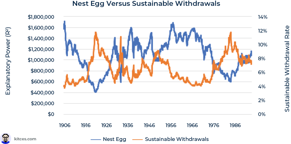
The graph below shows the inflation-adjusted balances of portfolios (in blue) built through 35 years of $1,000/month systematic inflation-adjusted savings to a 60/40 stock/bond portfolio. This shows what someone could have amassed as a retirement nest egg through systematic savings from, say, age 30 to 65. (Of course, given the vicissitudes of life, actual realistic savings behavior is unlikely to be so regular!) In orange, this graph also shows the sustainable 30-year real withdrawal rate available after that period of savings.
So for example, the values for January 1982 show the nest egg assembled for 35 years, from 1947 to the end of 1981, and the withdrawal rate achievable for the 30 years following, from the start of 1982 to the end of 2011.
These factors – nest egg and sustainable withdrawal rate – had a -0.78 correlation historically, suggesting a very strong negative relationship between the two variables.

The size of a nest egg at retirement, as built up through regular savings behavior, is subject to sequence-of-returns risk, with the returns toward the end of the savings period having a larger effect on the nest egg’s size than earlier returns, for the simple reason that the later portfolio balance is larger due to more accumulated contributions and growth. So, measuring the size of a hypothetical portfolio amassed through regular savings serves as a nice proxy for prior sequence of returns.
The inverse correlation seen in the chart above is just another way of seeing how stock market returns have been mean-reverting in the long-run (as work on CAPE also shows), and so prior sequence of returns (which determine the size of the nest egg) are strongly related to future sequence of returns (which determine the withdrawal rate).
The chart below shows that recent return sequences have almost no value when applied to retirement income decisions until the backward-looking window size can be measured in decades. The explanatory power (R2) for this ‘Nest Egg’ measure reaches 0.5 at about 23 years. As with CAPE, a longer time window is more powerful. Coincidentally, our 35-year Nest Egg measure above, chosen for its match in timescale to (a part of) an average worker’s career, is in the higher explanatory power zone, so we’ll continue to use 35-year Nest Egg in the examples below.

There are no hard-and-fast rules about what R2 value would be ‘good enough’ for an economic indicator to be deemed useful. (It is even possible for high R2 values to be spurious, reflecting over-fitting of the data, among other things.) Determining such a threshold depends on the purpose of the analysis. In some fields, like physics and chemistry, and for some uses, like measuring the tracking of an index fund to its index, we might want R2 values above 0.8 or 0.9. In the ‘messier’ world of retirement income planning, though, where we are typically seeking general insights into retirement conditions rather than near-perfect explanatory power, values of 0.4–0.5 – or even lower – might be enough to interest advisors.
As with CAPE, 35-year Nest Egg values and real withdrawal rates have an inverse relationship: periods with lower Nest Eggs have supported higher withdrawal rates, and vice versa. This inverse relationship points to the cyclical nature of historical return sequences: a low Nest Egg value (measured in dollars) is generally the result of recent poor returns, but that makes higher future returns, and therefore higher withdrawal rates (measured as a percentage) more likely.
In other words, low Nest Egg values have historically been paired with higher possible withdrawal rates (from that smaller portfolio). Conversely, higher Nest Eggs have historically been paired with lower possible withdrawal rates.

Because people spend in dollars, not in percentages, this inverse relationship means that the dollar withdrawals available to retirees (calculated as Nest Egg × Withdrawal Rate) would be much smoother than either the calculated Nest Egg or withdrawal rate measures.
For today’s retirees, this Nest Egg data holds some good news. While today’s 35-year Nest Egg measure ($1.3 million) is not low from a historical perspective, it is also not approaching all-time highs. The March 2022 value is 0.4 standard deviations above the historical mean – in the third quartile of historical Nest Egg levels. By contrast, the 35-year Nest Egg value in January of 2000 was just over $2 million – 2.6 standard deviations above the mean. In other words, by this measure, early 2022 is quite different from the height of the ‘tech bubble’.

Though this measure does not contradict the conclusion we drew from CAPE – it still supports a more cautious approach to current retirement spending – it may temper some of the alarm that high CAPE values might cause. Because while Nest Egg indicators may be a bit high, they are not excessively so.
Unlike CAPE, which depends on stock prices and corporate earnings, Nest Egg measures can be created using different asset allocations. In fact, Nest Egg measures seem to have the most power when applied to balanced portfolios, as we see in the graph below.

Of course, it is important to match the asset allocation used in calculating Nest Egg values to the allocation from which withdrawals will be taken (which the graph above does by matching pre- and post-retirement asset allocations.) Predictably, a mismatch between these two portfolios reduces the usefulness of the measure. At the extreme, a 100% stock portfolio used in the savings period has at best a relatively low 0.19 R2 explanatory power value when applied to a 100% bond portfolio used in retirement.
When the ‘pre-retirement’ and ‘post-retirement’ allocations match, the results are much better. As we can see above, R2 is above 0.5 for allocations of between 15% and 90% stock.
Keep in mind that, for this measure, we are not comparing a client’s actual pre-retirement and post-retirement portfolios. Nor are we using a client’s actual balance at retirement. Clearly, it is not realistic to assume that people now or in the past followed the systematic savings approach used to calculate Nest Egg measures. ‘Nest Egg’ assessment is just a handy, intuitive term for an abstract measure of prior sequences of returns, and so it can easily be used not just at retirement but also at any point in retirement simply by asking what a Nest Egg value would be today if someone were to have saved systematically for the decades leading up to that point in time.
Inflation
Not all economic factors relevant to retirement are investment measures. Consumer and producer sentiment, unemployment, and many other factors can yield useful information. However, we’ll look at just one more flavor of economic factor here: inflation.
Does the current annual inflation rate provide helpful context for retirement income planning, or do longer-term inflation averages hold more useful information? Since we would expect inflation measures to have more explanatory power when applied to retirement withdrawals from bond-heavy portfolios (as well as any other retirement plans with higher inflation risk), we use a 20/80 stock/bond portfolio to answer this question.
Once again, as the graph below indicates, longer-term indicators are more powerful than short-term trends. For inflation, we need to look at average rates over 8 years or more to find explanatory power at or above 0.3, and the highest R2 values are found with windows of 15 years or more. This means that short-term inflation rates, like the year-over-year annual rates commonly quoted in the press, have essentially zero straight-forwardly predictive value for retirement income planning.

Because they are very slow to react to changes in inflation, long-term inflation measures may be frustrating for advisors who would like to know what the recent rise in inflation (2021–2022) means for retirement. CAPE, on the other hand, reacts relatively quickly to changes in market prices since its numerator consists of real price. And Nest Egg values are meaningfully affected by recent returns, so market events quickly become ‘baked in’ to this measure as well. But 8-year average inflation has only recently begun to tick up (as of April 2022), and it is still below long-term averages.
In other words, if long-term inflation has a message for us today, it’s the same message that it’s had for a while! Long-term inflation measures are river barges, not speed boats, and while they can be useful as sources of general strategic information, they are not the best indicators to rely on for tactical decisions.
Also, unlike CAPE and Nest Eggs, long-term average inflation is positively correlated to future systematic withdrawal rates (e.g., 20-year inflation has a 0.78 correlation to 30-year real withdrawal rates from a 20/80 portfolio, whereas 8-year inflation has a correlation of 0.54). This means low inflation correlates with lower-than-average future spending. (In contrast, the inflation experienced during retirement is inversely related to sustainable spending rates.)
This positive correlation implies some level of reversion to the mean for inflation: a long period of low inflation tends to be followed by a period of higher inflation, and vice versa (there is indeed a small negative correlation of about -0.2 between long-term trailing and forward inflation). So, the reason for the observed positive correlation between long-term inflation and withdrawal rates is that high inflation (which is ‘expected’ when long-term inflation rates are low) will tend to depress retirement withdrawal rates going forward.

This is precisely what happened in the mid-to-late 1960s: Inflation was benign at that point, with long-term averages below 2%, but we now know that sustainable withdrawal rates were also low for this period because a lengthy time of high inflation and low real returns was coming.
A similar shift from low to high inflation may be exactly what we are experiencing today. (Although if inflation recovers to lower levels quickly, it may not be!) Current long-term inflation averages are still well below historical means because, until recently, annual inflation had often been under 2% – sometimes well under 2% or even negative. But this means that, with all else being equal, long-term inflation measures have been indicating lower retirement withdrawal rates for quite some time now.
Ultimately, how the current bout of inflation affects retirees will depend on the length of time over which inflation stays elevated. If inflation stays high, long-term inflation averages will eventually also become elevated and, as in the mid-to-late 1970s and early 1980s, higher long-term inflation will begin indicating that higher withdrawal rates may be possible going forward.
So, as with CAPE and Nest Eggs, inflation measures seem to be counseling caution for people making retirement spending decisions today. But what types of plans would potentially benefit from consulting inflation measures? While CAPE had the most to say about plans that included moderate to high stock allocations, and Nest Eggs can be used across plans with a variety of asset allocations, we would expect inflation to have a greater effect on plans with higher bond allocations. The chart below shows how R2 for long-term inflation averages decreases markedly as bond allocations decrease and stock allocations increase. (Intermediate US Treasuries were used to model bond returns in these examples.)

Long-term inflation has an R2 of over 0.65 when applied to a 100% bond portfolio. Which makes sense, as a portfolio of bonds is likely to be hurt more by rising interest rates (which we would expect in times of rising inflation) and helped more by falling rates, when compared to a portfolio of stocks. We would also expect this pattern for retirement plans that depend on nominal (not inflation-adjusted) pensions.
This doesn’t mean long-term inflation is useless for stock-heavy plans, but CAPE and Nest Eggs are much more powerful for these particular plans, and the additive effect of long-term inflation measures is small in these instances. In contrast, plans with more balanced portfolios can benefit more from combining market indicators like CAPE and inflation. For a 50/50 plan, adjusted R2 increases from 0.64 (CAPE alone) and 0.41 (20-year inflation alone) to 0.83 (both).
The Usefulness Of Economic Factors Depends On Plan Length
In the preceding examples we’ve explored how certain economic factors can provide insight into 30-year retirement spending. But evidence suggests that these indicators are less useful when planning horizons are shorter. The R2 of all three measures explored in detail above (i.e., CAPE values, Nest Eggs, and inflation) are much lower when applied to a 5- or 10-year plan than to a 30-year plan.

In other words, economic context is most profitably applied to long-term planning. It is less useful for fine-tuning retirement spending advice when someone is deep into retirement or for other reasons has a shorter planning horizon.
The reason shorter plans have less to gain from economic context is likely analogous to the reason that indicators like CAPE are poor predictors of short-term investment returns. Famously, CAPE has higher explanatory power when applied to future long-term returns than when applied to short-term returns (and, since CAPE is calculated entirely with inflation-adjusted values, its explanatory power applied to nominal stock returns is also less robust).

The graph above shows R2 of the traditional 10-year CAPE compared to total real stock returns across a variety of time windows. CAPE is not particularly helpful in the short-term (R2 was less than 0.05 for periods less than a year) but it does a reasonable job of informing total return expectations over eight years or more when R2 rises above 0.2.
How Advisors Can Use Economic Context In Financial Planning
Crucially, when it comes to using economic context to develop retirement planning recommendations, it is important to remember that what we’ve been discussing here isn’t investment advice on how to allocate a portfolio – this is spending advice on how much can be withdrawn from that portfolio over a long-term retirement.
Communicating Economic Context To Clients
Some advisors may simply use economic context to paint a fuller picture of the environment that retirees are in and may be living through in their retirement. When providing this context, historical graphics can be useful, such as the figure below, which shows the 30-year withdrawal level that would have been available from a $1 million 60/40 portfolio for each month since 1871. (The most recent value in this chart, March 1992, is exactly one 30-year ‘plan length’ before today. This is the most recent date from which someone could have completed a 30-year plan. Graphs like this may be familiar from some of the earliest work on historically sustainable withdrawal rates.)

The graph above also contains a line indicating this plan’s proposed spending level ($45,000/year) and shading for the 1/3 of displayed periods when CAPE was closest to its value today. Notice that this ‘CAPE filter’ picks out almost exclusively lower-withdrawal periods.
Charts like these can help answer questions like: Is the recommended spending level high or low, relative to history? How much variation in historical sustainable spending is there for a plan like this? Historically, have periods that are economically similar to today supported higher or lower spending than the average?
A presentation of this historical context might go something like this:
Advisor: Mr. and Mrs. Client, we believe that to fund your spending needs in retirement you should take $45,000 annually from your investment portfolio and adjust those withdrawals for inflation in the future.
To help put some context around that number, we’ve prepared this chart showing how much someone could have withdrawn from a similarly invested portfolio if they had begun this retirement plan at any point in the last 130 years and experienced those historical returns and inflation.
In past discussions together, you said you’d like to start retirement conservatively. As you can see, that $45,000 is relatively low compared to the amounts that people could have afforded historically.
You’ll notice that our recommended withdrawal level would have survived the returns and inflation experienced during the Great Depression without the need for a reduction in spending. In fact, other than some brief periods in the 1960s, this withdrawal level is below all historically sustainable spending levels. Though the future could of course be different than the past, we believe this means your plan is comparatively conservative.
As we’ve discussed, relative to history, we think stocks are comparatively expensive today. We’ve shaded in orange the periods when stock valuations were closest to what we find today. As you’ll see, the returns and inflation experienced in these periods tended to support lower levels of portfolio withdrawals. This is one reason we believe it is prudent to be cautious with your withdrawals early in retirement.
We will of course monitor your plan and the market environment going forward and make adjustments as needed.
Helpfully, a graph like this can be produced not just for plans that depend exclusively on portfolio withdrawals, but also for a range of other plans with different types of cash flows and diverse non-portfolio income sources, and even for plans that include changes in future spending such as the retirement smile.
The following graph is another example of how economic factors can help an advisor introduce a discussion around sustainable retirement spending for a household that depends exclusively on a $60,000/year pension that is not adjusted for inflation. In almost all historical periods, this household would have had to begin retirement with a spending level less than the full pension amount and would need to save the difference to offset future inflation. All historically possible real spending levels are well below $60,000, except for those in the 1920s, when the retirement period would have included deep and prolonged deflation. (This analysis assumes that amounts saved from pension income are invested in a 20/80 stock/bond portfolio, from which withdrawals were taken later in retirement.)

This figure can serve as a potentially useful way to add context to a retirement plan discussion, even when the plan does not primarily depend on investments. The conversation might go something like this:
Advisor: Mr. and Mrs. Client, we advise that you plan to spend $35,000 annually from your pension when you retire this year and invest the difference to offset the effects of future inflation. Over time, we’ll adjust that spending number upward to combat the effects of rising prices, and eventually – probably years down the road – you’ll be able to start spending the full pension check and withdrawing money from your investment account to supplement your spending.
I know it must seem odd that we don’t recommend that you spend all of your pension income now. The reason for this is that your pension won’t see future increases, but we do expect that your cost of living will go up over time as prices increase. So, we have to plan for how you can offset those future price increases.
To help provide some context around this $35,000 number, we’ve prepared this chart showing how much someone could have spent from the same sort of pension had they begun this retirement plan at any point in the last 130 years and sustained their standard of living through those historical periods of inflation.
You’ll notice that, with the sole exception of the 1920s, when households would have experienced years of deflation instead of inflation, possible spending was always well below $60,000/year. We’ve talked in the past about inflation potentially having a large impact on your retirement. This picture helps show the potential size of that impact.
That being said, I think this proposal will give us the power to manage the impact of inflation well. In this picture, we’ve shaded in orange periods when long-term inflation trends were similar to those we’ve seen up to today. With a few exceptions, these orange periods supported lower spending, relative to history.
You’ll also notice that our proposed spending level is at or below everything we’ve seen historically, including all of the Great Depression and World War I and II. The exception is a period in the 1960s and early 1970s. As you may know, those periods were followed by some of the highest and most prolonged inflation we’ve seen in the last 100 years.
We don’t believe it’s necessary to restrict your spending quite as much as that period in the 1960s and 1970s indicates, but we’ll of course be monitoring the situation and will suggest adjustments to this plan – up or down – if we think they are needed.
Concrete historical context can be more relatable than abstract statistical results like ‘probability of success’. For example, by pointing out the retirement income that would have been available starting from certain historical periods, such as the Great Depression or World War I and II, an advisor can demonstrate a sort of ‘historical stress test’ of the client’s situation. Though the future could of course be worse than the past, clients will typically understand that the Great Depression was not an easy time. If the proposed spending plan would have survived the Great Depression, this could help clients who are worried about major prolonged economic contraction to sleep better at night.
In these examples, we saw that historical periods with economic environments more like today’s tended to support lower income levels. In an economic environment very different from today’s, the message might be quite different, as we’ll see below.
Using Economic Context To Shape Retirement Planning Analyses
Moving beyond communicating economic context, some advisors may want a way to shape their retirement income plan analysis directly by using economic indicators.
It can be tempting to take patterns like we saw for CAPE and develop an equation using linear regression that will predict a specific withdrawal rate going forward. It might even be tempting to develop an equation that uses multiple indicators. But, while (multiple) regression has been used profitably in retirement income research, applying this methodology in practice can be tricky.
Such an approach could suggest to clients that income levels are straight-forwardly predictable from economic statistics. But, of course, this isn’t true. Reliance (and over-reliance) on regression also opens advisors up to the many possible pitfalls one can encounter in developing regression models, including data overfitting and data mining. Using a linear regression equation when the current value of the explanatory variable is (well) outside of the range of the fit data can also be problematic.
Perhaps more importantly though, regression equations only provide predicted values, not information on how economic factors can actually influence the spending/risk trade-off that is central to retirement spending decisions. If we’re not careful, regression methods could mean all clients who find themselves with the same financial resources would get the same advice. But that would ignore clients’ spending/risk preferences.
For example, two families with the same $60,000/year nominal pension, as in the example above, could have very different attitudes toward inflation risk and more (or less) willingness to give up current consumption to protect themselves from that risk. By using a broader view of the risk/return trade-off in retirement, advisors have a way to apply economic context but still help different clients make different decisions.
The relationship between retirement spending level and risk (i.e., the estimated chances that a spending level will not be sustainable for the rest of the plan and will require a downward adjustment at some point) can be visualized as a spending risk curve. The risk/return trade-off, and therefore the spending risk curve, is different for each family and each plan.
A spending risk curve shows the trade-off between taking on more risk and having a higher current standard of living. Viewed the other way around, spending risk curves show how much ‘safety’ (in terms of lower estimated risk) can be purchased by spending less. Framed in the more commonly encountered (but potentially problematic) success/failure framework (where a risk of 20 is an 80% probability of success), this trade-off could be stated as “how much lower is my probability of success if I raise spending by X?” and “how much higher would my probability of success be if I lowered spending by Y?”
When exploring economic context, we must use historical return sequences to create spending risk curves. Monte Carlo simulation, which depends on stochastic methods, cannot be used for economic exploration since we cannot profitably match economic variables to randomized return sequences.
The graph below shows two historical spending risk curves using data available as of March 2022: (i) the curve for a 30-year retirement funded exclusively from a $1 million 60/40 portfolio, using all available history since 1891, and (ii) the curve that includes only one half of historical sequences, namely those that began at points when CAPE was closest to its current value.

The lowest end of the risk curve stays roughly the same for both curves. That’s because we are excluding low-CAPE periods from the ‘CAPE-Filtered’ risk curve, and none of those (excluded) low-CAPE periods had low spending levels. However, the rest of the curve has shifted down. In other words, because today’s CAPE value is so elevated, we might expect lower income to be possible going forward at practically any income risk level.
This approach may smell a bit like ‘calling the top’ of the market. In other words, it may seem that this analysis assumes that stock markets will drop soon. But we are doing something much more mundane and unobjectionable here: we do not know whether CAPE is at its peak today, but we do know it is not at its trough. Excluding periods of exceptionally low CAPE from the risk/return picture is not calling the top of the market – it is just admitting that we should not behave as if the stock market has historically low valuations.
Imagine that it is early 2022, and that you are working with a client that is comfortable with a 30% chance that the spending level they choose now will be too high and will require a downward adjustment at some point in the future. (In discussing retirement spending risk, an advisor would ideally also include a discussion of what such adjustments could look like in the short and long term.) Looking at all of history (without the benefit of CAPE), $52,200/year appears to be the amount that could safely be withdrawn at the client’s particular spending risk level. However, with the addition of CAPE context, that same annual spending level of $52,200 had a 53% chance of being too high. Using the CAPE-filtered analysis, withdrawals of $46,900 would have been more appropriate for a client seeking a spending risk level of 30.
In June 1982, when the 10-year CAPE was a very low 6.3, the picture is different. Here many high-CAPE periods are excluded and, in contrast to the 2022 spending curve developed during early 2022’s high-valued CAPE, most parts of the CAPE-filtered spending risk curve go up relative to the curve reflecting all available history. (Both the “All Available History” and “CAPE-Filtered” versions of the risk curve contain only the history that would have been available as of June 1982.)

CAPE would have told an advisor in 1982 that risk was relatively low and, therefore, spending could be higher. This difference is not small: with the context of CAPE, withdrawals of $65,500/year had a historical spending risk of 30, while without this context these withdrawals had a risk of 55. The spending level at a risk of 30 is 23% higher with CAPE context ($65,500) than without ($53,200).
In applying CAPE context, a 1982 advisor would not be claiming to know that CAPE had hit a trough – that would not have been known at the time. Instead, this graph simply reflects the fact, which could have been known and uncontroversial at the time (had CAPE been a known concept), that CAPE was not at a peak.
The sorts of ‘risk curve’ analyses explored here are not limited to CAPE nor to only a single economic factor. Instead, these approaches can be expanded to include a multi-dimensional picture of economic context that includes market valuation and inflation measures along with other factors such as consumer sentiment and unemployment. After all, we saw that for plans with balanced portfolios, even a combination of just two factors – CAPE and long-term inflation – significantly improves the explanatory power of economic context.
In the end, economic context cannot hope to completely determine how a retiree should behave in retirement or the financial choices they should make. However, economic information can add significant and helpful context both to the conversation around retirement planning and to plan analysis!

