
In the light of recent debates about whether we are back in the 1970s, where the only ostensible similarity is that inflation has accelerated over the last year or so, I dug into my data archives to remind myself of a few things. One of the problems with dealing with official data is that it gets revised from time to time and time series become discontinuous. So the labour market data for Australia tends to start in February 1978 when the Australian Bureau of Statistics moved to a monthly labour force survey. Researchers who desire to study historical data have to have been around a while and have saved their earlier data collections (such as me). But it is often impossible to match them with the newer publicly available data. You will see in what follows how that plays out. But, I was also interested to return to the past today after the ABS released their latest – Industrial Disputes, Australia – data (released March 9, 2023), which shows that disputes remain at record lows. So in what follows I show you how far removed the current situation is from what happened in the 1970s and this renders the narratives from our central bankers a pack of lies.
The history of industrial disputes
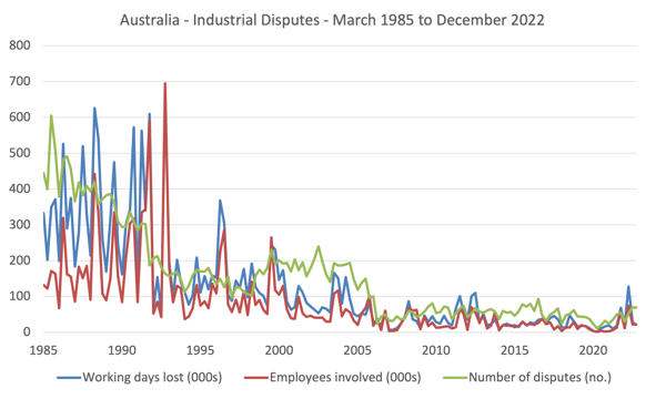
There are various ways in which one can analyse the manifestations of class warfare – number of disputes, number of working days lost, and the number of employees involved.
The current industrial disputes data series from the ABS start at the March-quarter 1985 and provide data on all three measures up until the December-quarter 2022.
The first graph shows the three series over that period and while there is a lot of noise in the data, the trends are clear.
This decline in industrial disputation has been huge and has been the result of deliberate public policy to weaken unions and make it easier for bosses to prosecute unions who engage in industrial action.
The decline marked the beginning of the period when government turned from being a mediator in the class struggle between labour and capital and became an agent for capital.
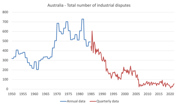
But we get an even better idea of how the industrial relations terrain has shifted by patching together older annual data from 1950 to 1984 to the current quarterly data shown in the previous graph.
The next graph shows the number of industrial disputes from 1950 to the December-quarter 2022 (the data was annual up to 1985 and then quarterly).
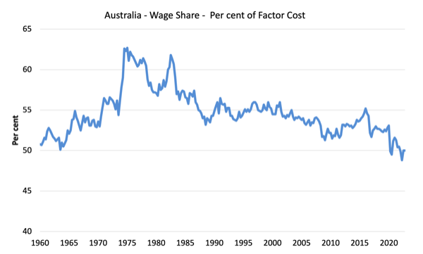
Further, we have consistent wage share data from the September-quarter 1959 to the December-quarter 2022, which is shown in the next graph.
The distribution of national income in terms of the wages share began the period (March-1985) at 56.6 per cent (after peaking at 62.7 per cent in the March-quarter 1975).
By the December-quarter 2022, the wage share had fallen to 50 per cent.
It is easy to see that when trade unions are able to effectively represent their members’ interests then the wage share is higher.
The problem is that trade union membership has fallen dramatically since the mid-1970s.
Historical – Trade Union Statistics, Australia, December 1975 – show that union membership was on the rise in that year:
Total membership increased by 52,100 (1.9 per cent) • Total membership increased by 52,100 (1.9 per cent) over 1974 to 2,814,000 … Between 1970 and 1975 male membership increased by 12 per cent and female membership by SO per by 12 per cent and female membership by SO per cent.
Scaling that by the size of the labour force, we learn that:
Trade union members at the end of 1975 represented 58 per cent of employed wage and salary earners. The 58 per cent of employed wage and salary earners. The percentage for malles was 63 per cent and for femalles percentage per 48 per cent.
Pretty heady stuff really.
Fast track into the present and the most recent ABS release of relevance – Trade Union Membership – tells a bleak story for workers:
– 12.5% of employees (1.4 million) were trade union members.
– Since 1992, the proportion of employees who were trade union members has fallen from 41% to 12.5%.
So in 1975, the coverage was 58 per cent.
By 1992, it has fallen to 41 per cent.
And by August 2022, it was down to 12.5 per cent.
We left the 1970s, a long time ago!
Phillips curve analysis
To map these labour force trends (disputes and trade union membership) into an inflation narrative, we need to construct some Phillips curves, which relate the unemployment rate (as a proxy for the strength of demand in the labour market) to measures of price or wage inflation.
The original Phillips curve first revealed in 1958 was in terms of the relationship between wage inflation and the unemployment rate.
In my PhD thesis, I showed that, in fact, the provenance of the relationship went back much earlier but it was the work of A.W. Phillips that attracted the attention.
In 1960, Paul Samuelson and Robert Solow converted the ‘wage Phillips curve’ into a price inflation curve by arguing that nominal wage pressure pushed up unit costs which were then passed on via mark-ups to the prices of final goods and services.
It is very hard getting a comparable wage data back in time as the statistician has altered the definitions etc creating several discontinuities.
So I dug into my archives and was able to construct this graph from the September-quarter 1960 to the March-quarter 1996.
The important point is that this data covers the turbulent period in the 1970s when the OPEC oil cartel pushed up oil prices significantly and the resulting imported oil prices set off a distributional struggle between workers and capital over who was going to take the real income loss as a result of the higher import prices.
I have constructed Phillips curves in both price and wage terms (annual growth on the vertical axis) with the official unemployment rate on the horizontal axis.
The two different ‘inflation’ measures are differentiated by the shape and colour of the markers.
I split the data into two sub-samples:
1. March-quarter 1960 to June-quarter 1973.
2. September-quarter 1973 to the March-quarter 1996.
The split in the sample is when the industrial mayhem really took off.
The lines between the observations in the second sub-sample help you to understand the trajectory of the wage and price inflation measures around the time of the split.
There were very strong nominal wage demands in 1974 as workers defended their real wages.
The wages growth was also pushed along in 1974 as a result of a large public sector wage realignment under the then Labor government.
The point is that the real wage resistance pushed up real unit costs (which is measured by the wage share) significantly and corporations then used their market price setting power to defend their profit margins.
So the initial supply shock from the imported oil price hikes soon became an endemic structural inflation in the domestic economy pushed along by the distributional struggle between wages and profits.
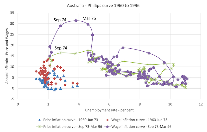
The shift to the right in the relationship over the course of 1974, was characterised by the Monetarists as evidence that the natural rate of unemployment had risen.
The reality was that it really marked the start of the obsession against fiscal deficits and at that time, governments abandoned their Post-WW2 commitment to full employment and pursued fiscal contraction designed to hold the unemployment rate at elevated levels while purging trade unions of their capacity to get wage increases for their members.
Fast track to the current period.
The next graph shows the data from the March-quarter 1979 to the December-quarter 2022.
The difference between the episodes – 1970s and now – is very stark.
Wages growth has been very subdued over the last few years and the current inflation rate is accelerating well above it, leading to systematic and significant real wage cuts.
Those cuts are increasing in size.
The data shows that there is no wage-price spiral and as inflation was accelerating in response to the supply factors wages growth was barely moving.
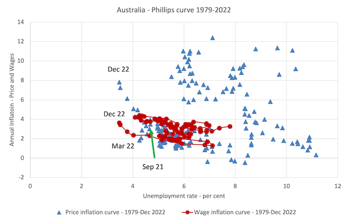
There is also strong evidence that corporations are profit gouging ‘because they can’ – doing so by using the smokescreen of rising costs except the price acceleration is well ahead of the cost acceleration.
Last week, I cancelled a relationship with a firm in the construction industry who I wanted to do some work for me because they came back with a revised contract with something like 150 per cent increases in the quote ‘because of rising costs’. No costs have risen that much. They were shown the door.
Video – the Current Inflation – Causes and Remedies
As part of the on-going MMTed edX MOOC that we are running which provides free education for those wanting to learn Modern Monetary Theory (MMT), I created a new video to update the material from the last time we ran this course.
All the other video material is only available to participants in the course but I decided to make this one generally available.
I had to do it very quickly yesterday (no scripts) and was not in my usual filming location so I did a quick and dirty Zoom recording (with any meeting participants) which gets the job done but the quality is less than perfect in terms of how it deals with syncing the video with the audio.
But at any rate it gets the message across.
Conclusion
The point of today’s blog post is that this inflationary episode is not at all like what the globe experienced in the 1970s.
The problem is that central bankers keep referring to wage-price spirals and expectations to justify their decisions to hike rates.
The reality is that those justifications are just smokescreens and there is no justification for what is being done under the aegis of monetary policy.
That is enough for today!
(c) Copyright 2023 William Mitchell. All Rights Reserved.
