

The future of competing websites has already begun its new evolution.
One in which websites that provide a highly personalized user experience gain superiority over ones that lack this fundamental attribute.
In essence, modern and advancing websites are quickly becoming more than just a home base to showcase your services, they are becoming lead generation powerhouses.
However, in order to generate high quality leads, your website needs to be designed to meet your target audience’s expectations.
We’re going to share 7 critical website design principles that are simple, yet effective once implemented.
Creating a personalized user experience for your visitors through a well-designed website helps foster ease of use as well as supports user engagement, meaning your website will be more successful in driving traffic and generating leads for the long run.

After all, no one likes a website that frustrates them or has them feeling like they are in the wrong place.
That’s why your website needs to be easy to use while speaking to the pain points and desires of your target audience.
Since design can have such a big impact on functionality, here are 7 basic website design principles that advisors like yourself should keep in mind to stay ahead of your competition.
1. 7±2 Principle
According to George A. Miller’s studies, humans can retain only five to nine things in their short-term memory at one time.
Since the human brain is limited in its capacity to process information and handles this limitation by dividing information into chunks and units, it has been argued that website navigation menus should also be limited to containing only five to nine items.
So keep that navigation bar at the top short and sweet!
2. 2-Second Rule
Perhaps a more obvious principle is the 2-Second Rule which states that the less time that users have to wait, the better the user experience will be.
47% of users expect an average website to load within 2 seconds, and 40% of visitors will abandon a site if it takes more than 3 seconds to load. That’s a significant portion of potential leads lost if your website is taking too long to load.
This will also negatively impact your SEO, as google will interpret that you did not provide value for that search intent and will then drop your webpage ranking on search engine results pages.
Be sure to test your website pages and if they aren’t passing the 2-Second test, you know what you need to do next.
3. 3-Click Rule
While the 3-Click Rule is no longer considered one of the fundamental building blocks for producing a website with a great user experience (UX) design, it does emphasize the importance of providing a clear user journey for your visitors.
As stressed many times before, content is king but so is an intuitive website design that takes users to the information that they need to make a decision.
According to the 3-Click Rule, users stop using a website if they aren’t able to find the information they are looking for or access the website’s features within three mouse clicks.

Although it’s unlikely that your visitors are counting their mouse clicks once they land on your website, it still adheres to the basic usability principle that a good website is one that promotes easy navigation.
In short, don’t confuse your website visitors. Make it easy for them to find the information that they need and don’t bury it in your web pages.
4. 80/20 Rule
The Pareto Principle states that 80% of the effects come from 20% of the causes. Wait…so what does that exactly mean?

In the wonderful world of web design, this means that dramatic improvements can be achieved by identifying 20% of users, customers, activities, services or processes that account for 80% of your profit and then maximizing the attention you pay to them.
For instance, if the majority of your leads come from a certain e-Book you give out once every two months, consider pushing out that e-Book more regularly.
5. 8 Golden Rules of Interface Design
From his interface design studies, Ben Shneiderman proposed a collection of principles that he derived from experience and that apply to most interactive systems.
These set of principles are relevant to user interfaces as well as web design:
- Strive for consistency
- Provide a consistent user experience for the visitor. Use the same branded colours, messaging, terminology, fonts, prompts, etc.
- Seek universal usability
- Ensure that everyone, from beginner to advanced users, is able to navigate and use your website with ease.
- Offer informative feedback
- For every action taken on your website, there should be some form of feedback. For example, when a user hovers over a CTA button, that button could expand or change colours.
- Design dialogues to yield closure
- Ensure that any action taken on your website signals completion to the user. For example, if a visitor has completed a ‘Contact Us’ form, there should be a message that confirms the form was completed and their contact information was received.
- Prevent errors
- To make the user experience as enjoyable as possible, ensure that there are easy solutions for errors that visitors may accidentally make on your website. If they have put in the wrong postal code for their address on a form, have them fix only that section, don’t have them start over from scratch.
- Permit easy reversal of actions
- Encourage exploration of your website by making it easy for visitors to reverse actions that they take, such as returning back to a previous webpage.
- Keep users in control
- Let visitors explore your website in the ways that they desire. Don’t automatically take visitors to web pages that they didn’t click on.
- Reduce short-term memory load
- Keep your website as simple as possible. This includes forms, the navigation bar, and more.
6. Fitt’s Law
In 1954, Paul Fitts created a law stating that human movement towards a target area is dependent on the distance to that target and its size.
Essentially, targets that are smaller and further away are more time-consuming to select.
In relation to website usability, this rule reinforces the changes that need to be made in order to reap the benefits of increased accessibility and improved click rates.
For example, if a financial advisor wishes for visitors to click on his call to action button, he will place it near the top of the webpage and/or the sidebar versus in the footer. This will be easier for the visitor to access and click.
7. Inverted Pyramid
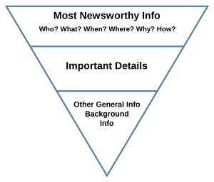
The Inverted Pyramid is also a well-known principle in journalism where writers give their readers a summary of what is most important, before revealing finer details about a topic.
Also known as the “waterfall” effect, this principle can be applied to web design.
This is because visitors will only take a few seconds to form an opinion about your website.
In those few seconds, you will want to catch their eye immediately so that they stay on your page and hopefully, provide you with their contact information or contact you themselves.
Key Takeaways
Making strides in building captivating and personalized websites can help you attract more website traffic, keep your target audience on your page for longer, and potentially generate new leads.
As such, don’t just make your website a pretty sight to see; ensure it also promotes ease of use and intuitive functionality if you want your viewers to find value and eventually become new clients.
